carpool - B2C mobile app
Case Study
Degree Project [non commercial]
Pre-Design
Intro. Problem. Research. Patterns. Ideation. Filter Ideas.
Design
Crazy 8. Lo-fi Design. Usability Testing. CJM. Hi-fi Design..
Post Design
KPI. Traction. Next Steps.
Intro
The global carpooling market size was $4.2B in 2018 and is projected to become $11.4B in 2025 (Source)

Problem
Unlike Trainline for train tickets or Ticketmaster for concert tickets, no app became the #1 go-to app for carpooling.
Research
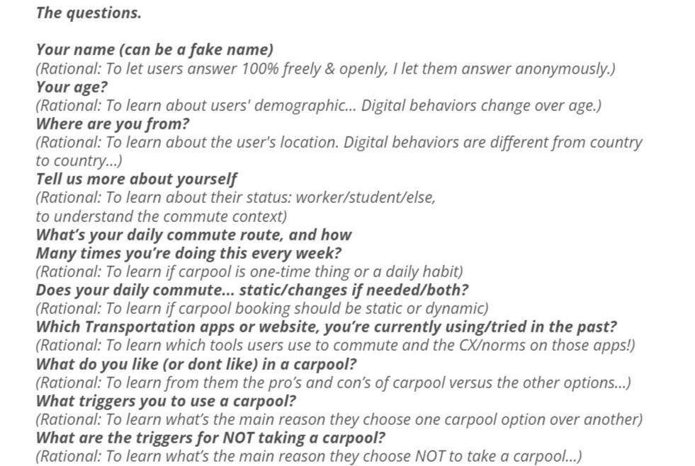
Understanding users’ needs and behavior is crucial for a great experience. Therefore I deep dive into research for the target audience and competing market first to develop the project’s strategy. 1st step: craft a survey I posted on carpool forums [Fb groups] then interview users [mostly Israeli soldiers trying to get to their base.] and do some competitive audits on carpool apps like BlaBlaCar, Lyft, Uber, etc.

Patterns
After collecting all the data from the users, I found patterns in the answers: Ex. carpooling isn't an impulse event [Like Uber], It's a daily task [commute to/from work/Uni].
Ideation
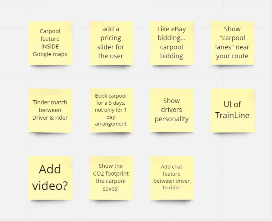
After gaining those insights from the users, I tried to gain as many ideas as possible, that align with the users' needs & norms.
Filter Ideas
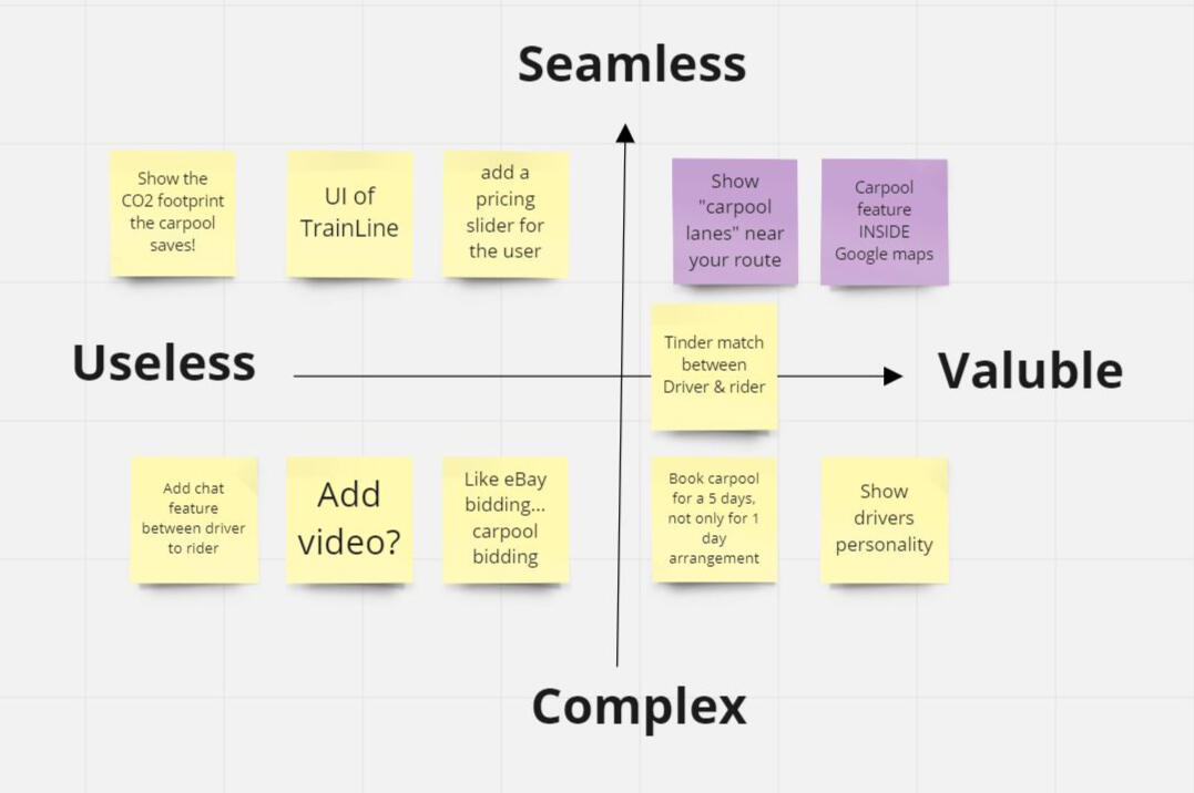
To focus on what's valuable for the users, and what will be a seamless CX so they would come back - I filter the "nice to have" ideas and the complex ones... OUT.
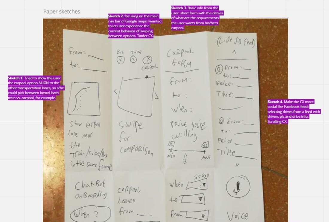
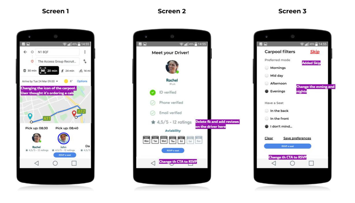
"Crazy 8"
Drafted 8 different UI sketches, and then critic them to find the right one to start working on [lo-fi design].
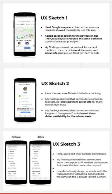
Lo-fi Design
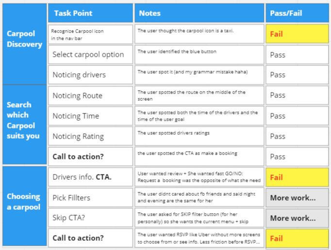
Taking a low-fi design to real users with usability tasks, to see if it "Pass" [all good!] or "Fail" [Fix] or "needs more work" [small tweaks].
Usability Testing
Taking a low-fi design to real users with usability tasks, to see if "Pass" [all good!] or "Fail" [Fix] or "needs more work" [small tweaks].
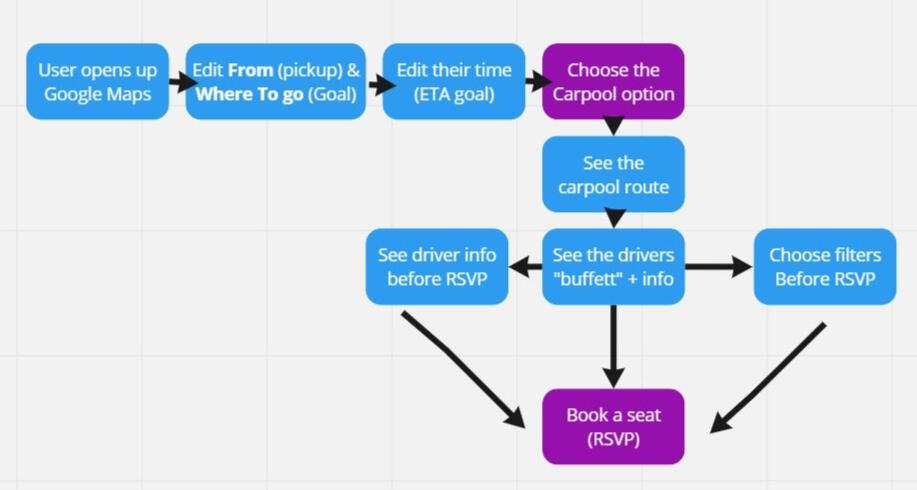
CJM
Now, it's the right time to craft the Customer Journey Mapping, as I can tell which steps in the journey are pain points and if I can "shortcut" the journey for the user.
A smooth user experience is the holy grail of interface design. I believe that even the most complex challenges can be solved through design.
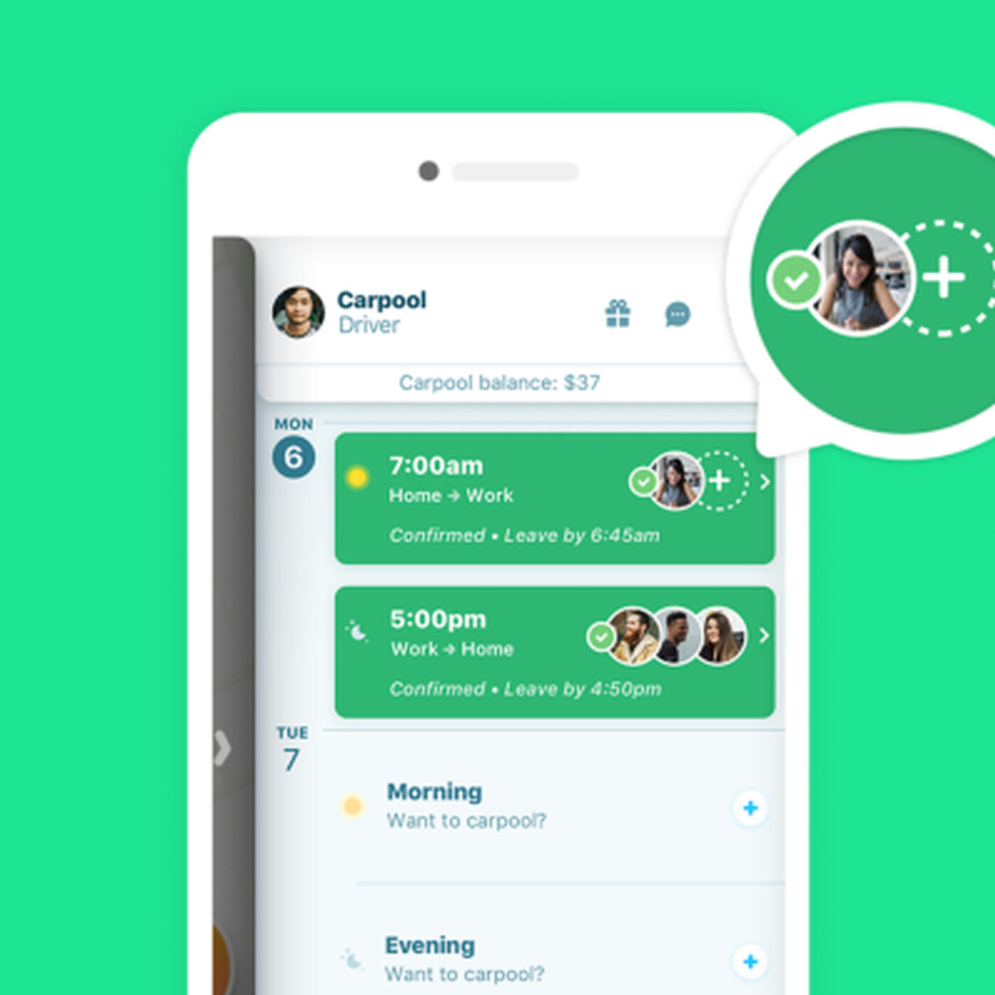
Hi-fi Design
Tweaks the design to Hi-fi Design following the results of the usability tests I've done [see above].
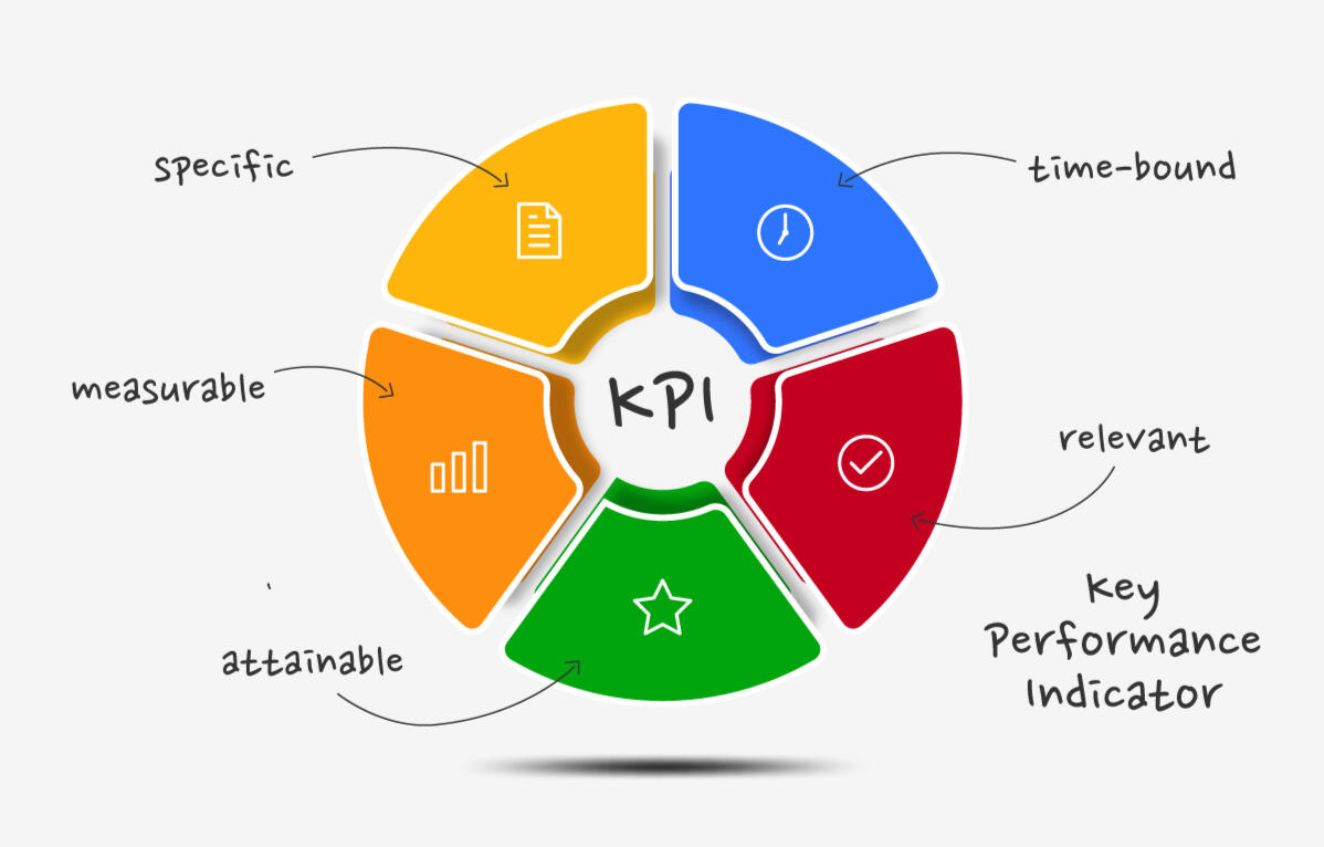
KPI
MEASURE
- Retention: Do users come back? If so, each day/week/month?
- Drop-offs: Which screen/button most drop off? Is it the text or icon or color or else [accessibility]?
- Friction: Do the users feel friction or feel it's a "shortcut"?
- Cohorts: Difference in traction per age/time on app/etc.
Traction
More than +1K designers chose to use it, in the Figma community.

Next Steps
Design the other screens [like FAQ] and measure traction, by interviewing users, MVT, Analytics, and more.
© Nadav Raviv 2024. All rights reserved.